Watch Carbon Dioxide Move Through Earth’s Atmosphere
What we're looking at
This global map shows concentrations of carbon dioxide as the gas moved through Earth’s atmosphere from January through March 2020, driven by wind patterns and atmospheric circulation.
Because of the model’s high resolution, you can zoom in and see carbon dioxide emissions rising from power plants, fires, and cities, then spreading across continents and oceans.
“As scientists, we're trying to account for where carbon comes from and how that impacts the planet to better inform policymakers,” said climate scientist Lesley Ott at NASA’s Goddard Space Flight Center in Greenbelt, Maryland. “You see here how everything is interconnected by these different weather patterns.”
What are the sources of CO2?
Over China, the United States, and South Asia, the majority of emissions came from power plants, industrial facilities, and cars and trucks, Ott said. Meanwhile, in Africa and South America, emissions largely stemmed from fires, especially those related to land management, controlled agricultural burns and deforestation, along with the burning of oil and coal. Fires release carbon dioxide as they burn.
Why does the map look like it’s pulsing?
There are two primary reasons for the pulsing: First, fires have a clear day-night cycle. They typically flare up during the day and die down at night.
Second, you’re seeing the absorption and release of carbon dioxide as trees and plants photosynthesize. Earth’s land and oceans absorb about 50% of carbon dioxide; these are natural carbon sinks. Plants take up carbon dioxide during the day as they photosynthesize and then release it at night through respiration. Notice that much of the pulsing occurred in regions with lots of trees, like mid- or high-latitude forests. And because the data were taken during the Southern Hemisphere summer, you see more pulsing in the tropics and South America, where it was the active growing season.
Some of the pulsing also comes from the planetary boundary layer — the lowest 3,000 feet (900 meters) of the atmosphere — which rises as the Earth’s surface is heated by sunlight during the day, then falls as it cools at night.
The data that drives it
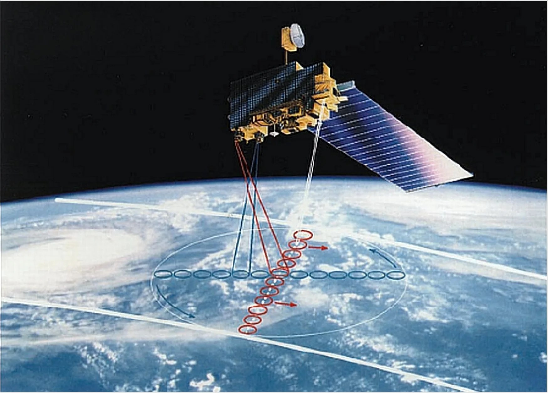
The map was created by NASA’s Scientific Visualization Studio using a model called GEOS, short for the Goddard Earth Observing System. GEOS is a high-resolution weather model, powered by supercomputers, that is used to simulate what was happening in the atmosphere — including storm systems, cloud formations, and other natural events. GEOS pulls in billions of data points from ground observations and satellite instruments, such as the Terra satellite’s MODIS and the Suomi-NPP satellite’s VIIRS instruments. Its resolution is more than 100 times greater than a typical weather model.
Ott and other climate scientists wanted to know what GEOS would show if it was used to model the movement and density of carbon dioxide in the global atmosphere.
“We had this opportunity to say: can we tag along and see what really high-resolution CO2 looks like?” Ott said. “We had a feeling we were going to see plume structures and things that we've never been able to see when we do these coarser resolution simulations.”
Her instinct was right. “Just seeing how persistent the plumes were and the interaction of the plumes with weather systems, it was tremendous.”
Why it matters
We can’t tackle climate change without confronting the fact that we’re emitting massive amounts of CO2, and it’s warming the atmosphere, Ott said.
Carbon dioxide is a heat-trapping greenhouse gas and the primary reason for Earth’s rising temperatures. As CO2 builds in the atmosphere, it warms our planet. This is clear in the numbers. 2023 was the hottest year on record, according to scientists from NASA’s Goddard Institute for Space Studies (GISS) in New York. Most of the 10 hottest years on record have occurred in the past decade.
All this carbon dioxide isn’t harmful to air quality. In fact, we need some carbon dioxide to keep the planet warm enough for life to exist. But when too much CO2 is pumped into the atmosphere, the Earth warms too much and too fast. That’s what has been happening for at least the past half century. The concentration of carbon dioxide in the atmosphere increased from approximately 278 parts per million in 1750, the beginning of the industrial era, to 427 parts per million in May 2024.
Human activities have “unequivocally caused warming,” according to the latest report by the Intergovernmental Panel on Climate Change. This warming is leading to all sorts of changes to our climate, including more intense storms, wildfires, heat waves, and rising sea levels.
Inside the SVS studio
Carbon dioxide exists everywhere in the atmosphere, and the challenge for AJ Christensen, a senior visualization designer at NASA’s Goddard Space Flight Center, was to show the differences in density of this invisible gas.
“We didn’t want people to get the impression that there was no carbon dioxide in these sparser regions,” Christensen said. “But we also wanted to really highlight the dense regions because that’s the interesting feature of the data. We were trying to show that there’s a lot of density over New York and Beijing.”
Data visualizations help people understand how Earth’s systems work, and they can help scientists find patterns in massive datasets, Ott said.
“What’s happening is you’re stitching together this very complex array of models to make use of the different satellite data, and that’s helping us fill in this broad puzzle of all the processes that control carbon dioxide,” Ott said. “The hope is that if we understand greenhouse gases really well today, we'll be able to build models that better predict them over the next decades or even centuries.”
For more information and data on greenhouse gases, visit the U.S. Greenhouse Gas Center.


